Tool
InstaDash is a Nigerian-based delivery service app that allows customers to order groceries, food, and other essentials to their preferred location.
Challenge
As the sole designer on this 2021 project, I handled every aspect of the design process, including creating wireframes and prototypes from user stories and needs, conducting user testing, iterating based on feedback, and delivering the final high-fidelity designs. This early career project required managing multiple responsibilities and making critical design choices.
Outcome
This project was a valuable learning experience. It taught me the importance of user testing and drawing inspiration from similar apps to create effective and user-centered design solutions. By advocating for design principles, I significantly enhanced the quality of the apps we created. My work on this project helped me develop a deeper understanding of design choices and user needs, which has greatly contributed to my success in subsequent projects.
Revolutionizing nigerian food delivery with InstaDash's intuitive, user-friendly app.
- InstaDash aimed to fill a gap in the Nigerian food delivery market.
- We aimed to emulate a modern user experience when customers interact with the food delivery app.
- The shopper side of the app was designed to be intuitive, flexible, and efficient for our shoppers.

Develop comprehensive app specifications and refine designs in collaboration.
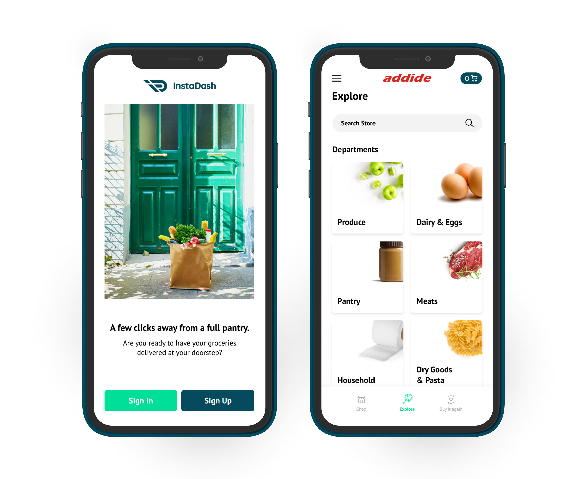
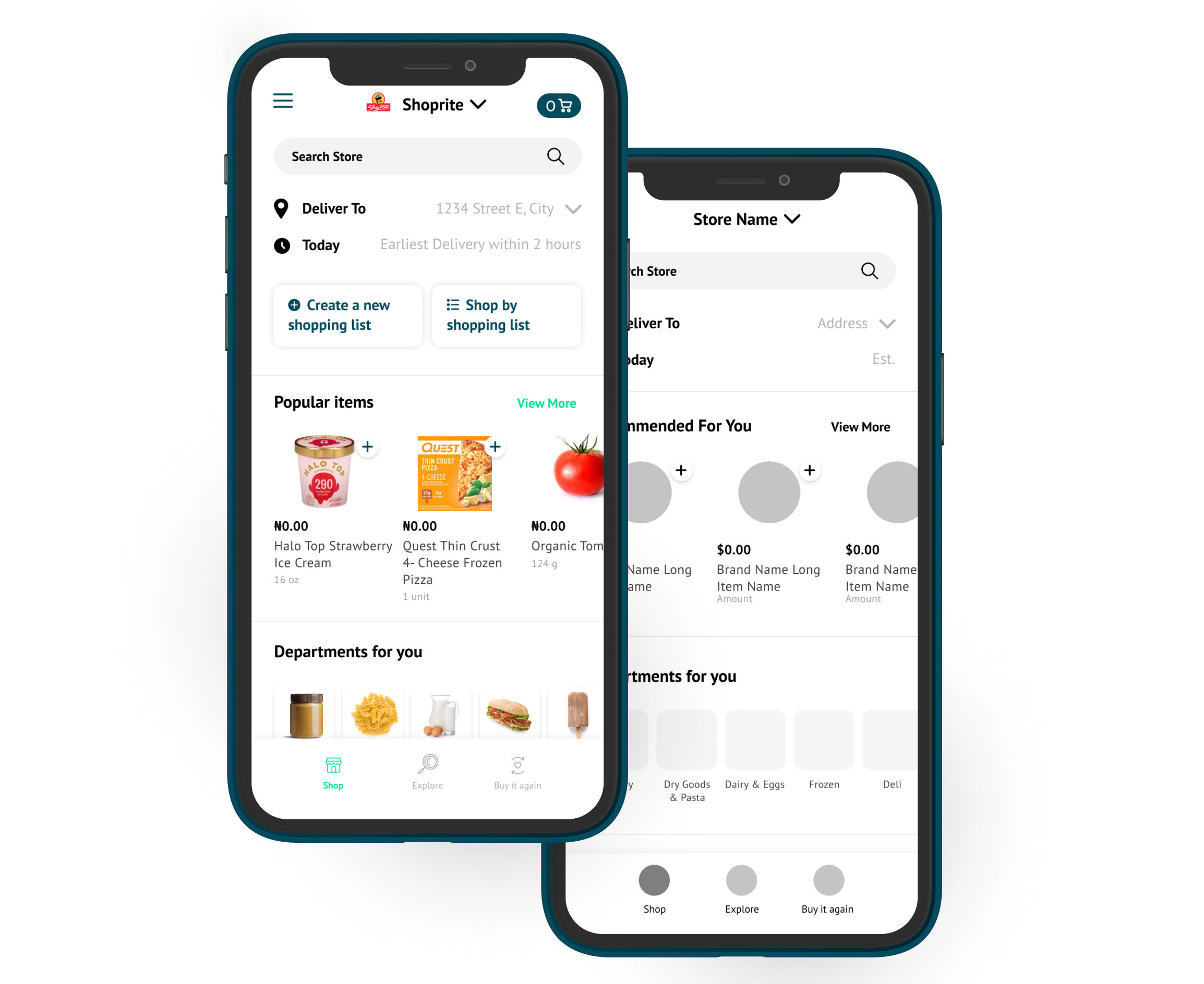
In collaboration with our client, engineers, project manager, and myself, we developed specifications for the app's various components: the customer side, shopper side, and admin side. I started by wireframing the screens and submitted them for feedback before refining the designs to a higher fidelity.
User Testing enhanced app development and uncovered key features.
As the company's first designer, I discovered that essential design principles, such as user testing, were not yet integrated into the app development process. I educated my team and our client on the value and benefits of user testing and arranged sessions through an online service. I developed a prototype and a testing guide for participants. The user testing sessions uncovered necessary feature additions, ensuring an optimal user experience.
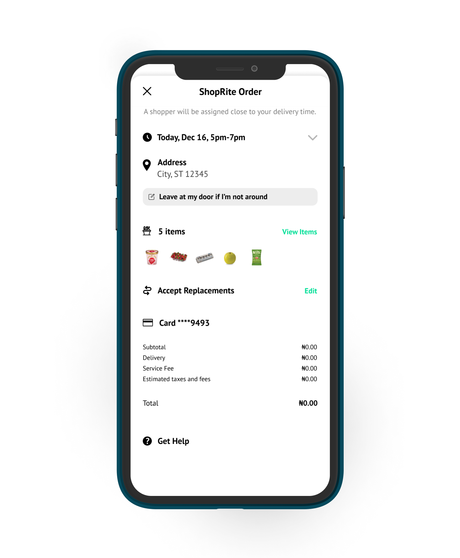
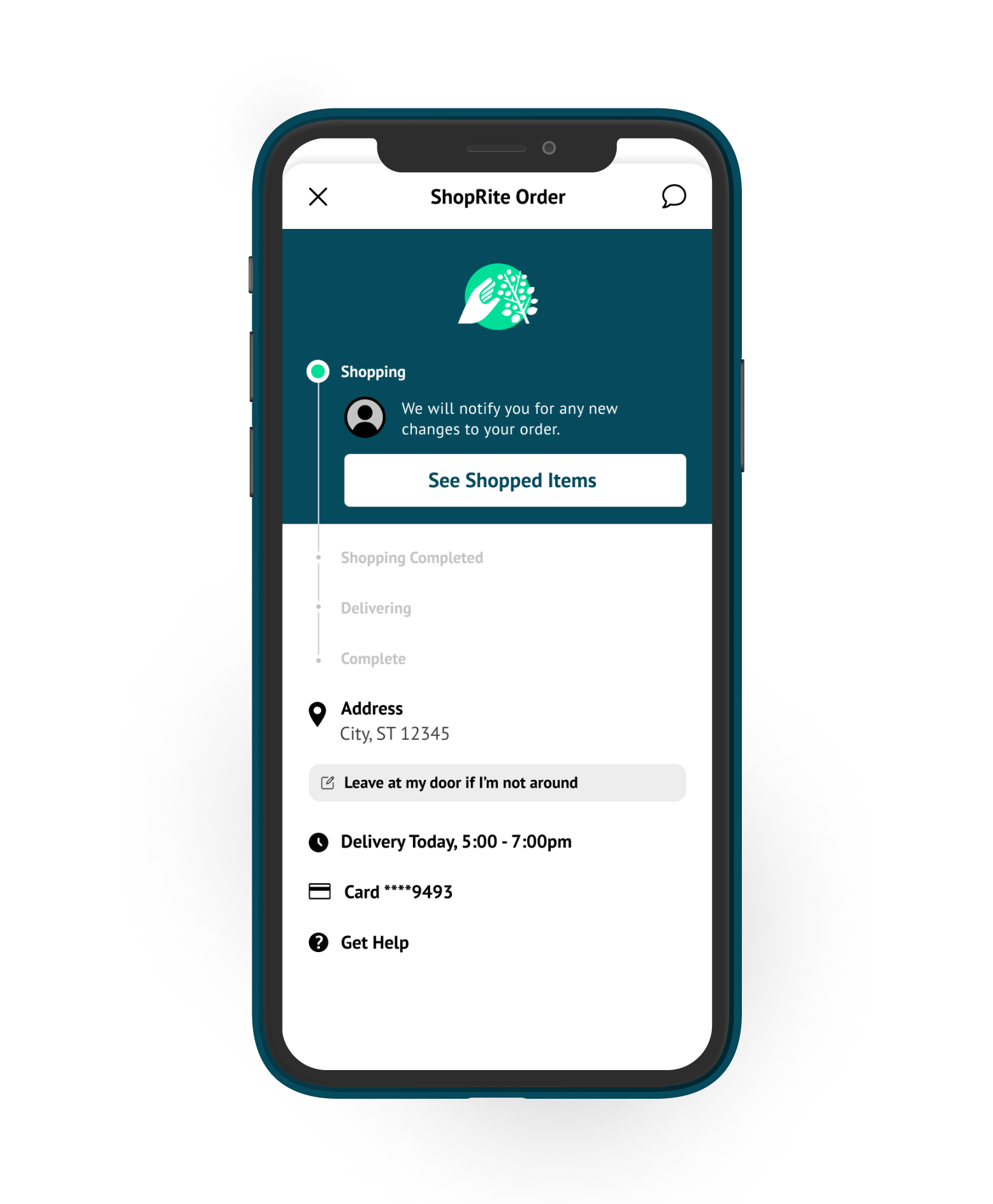
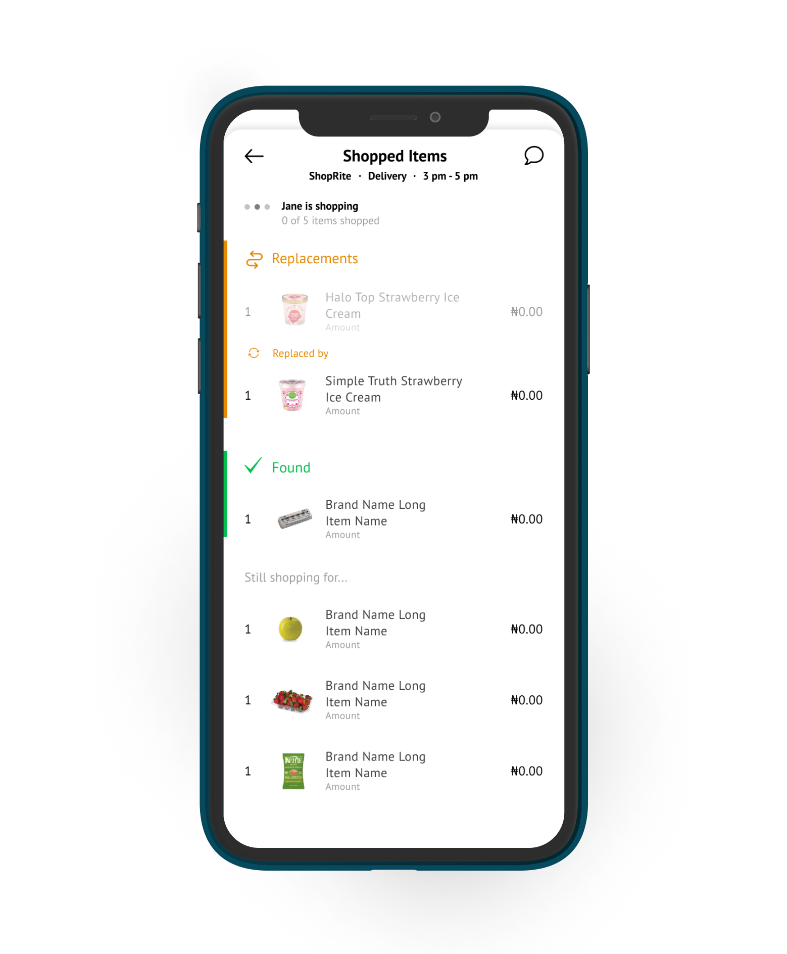
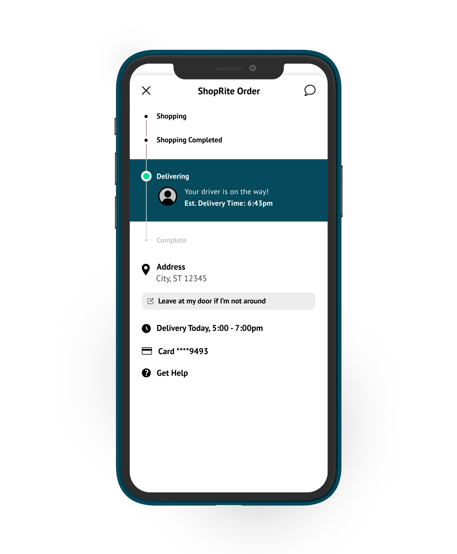
Customer Side - Order Placed Flow - Wireframes x HiFi
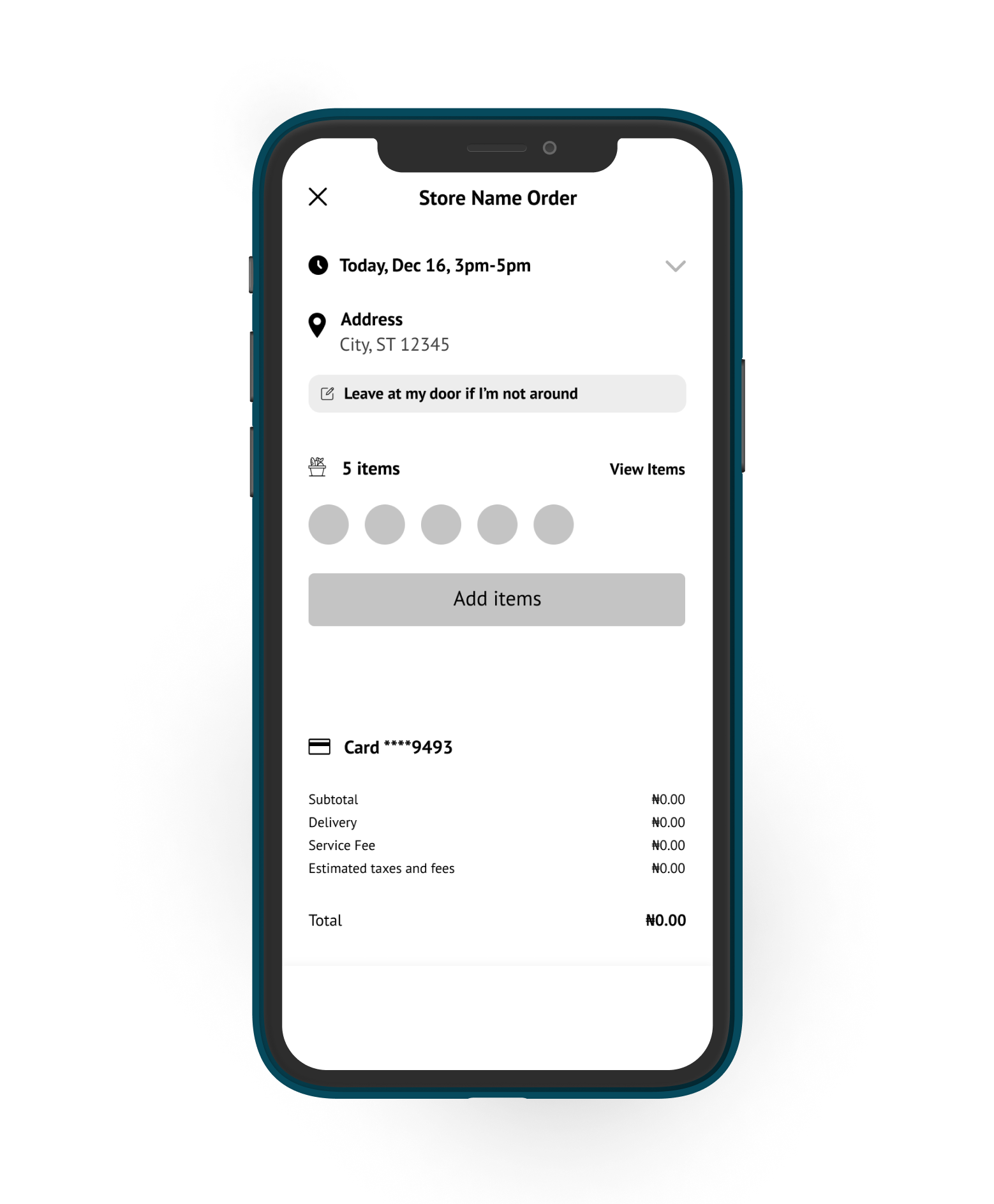
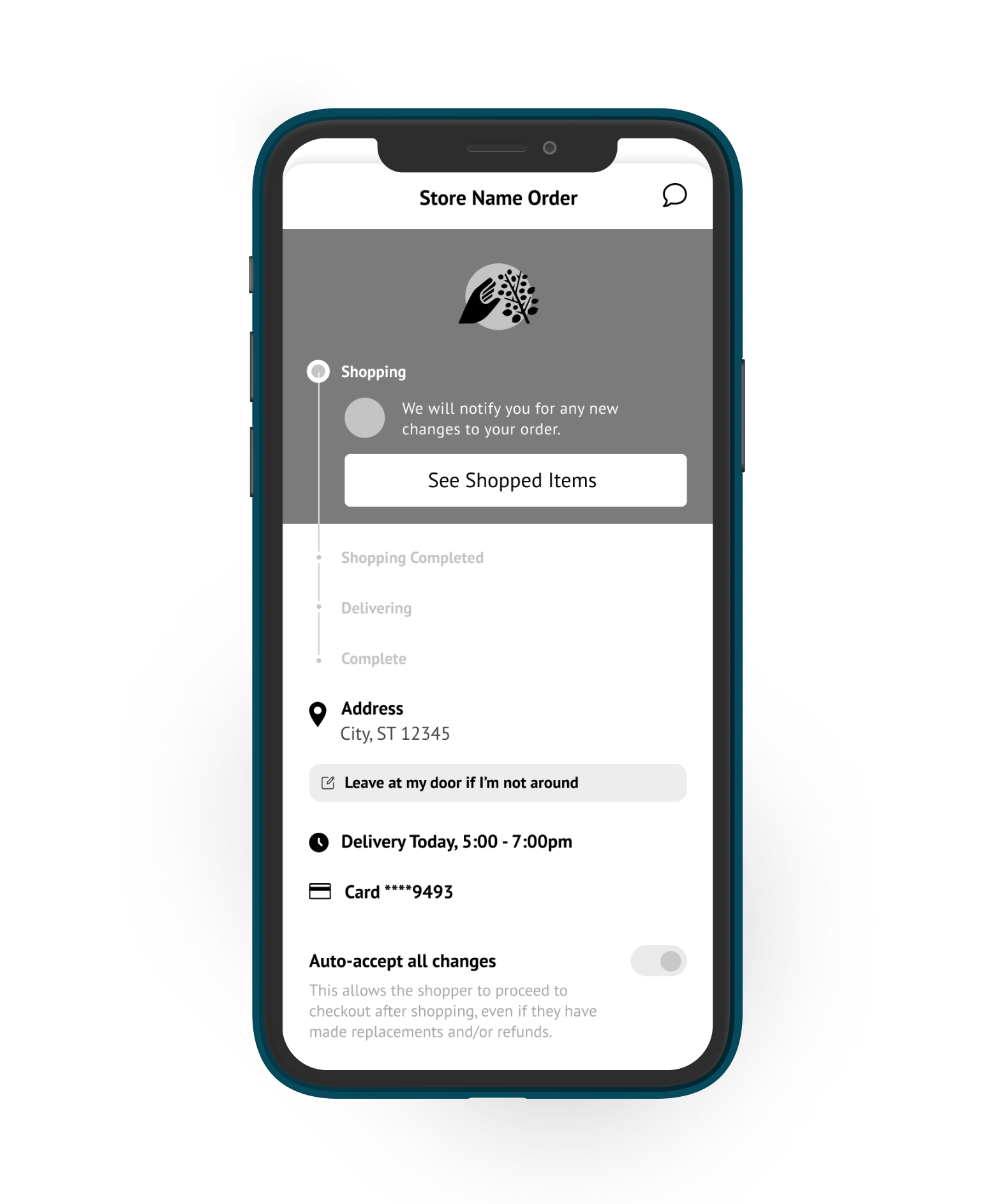
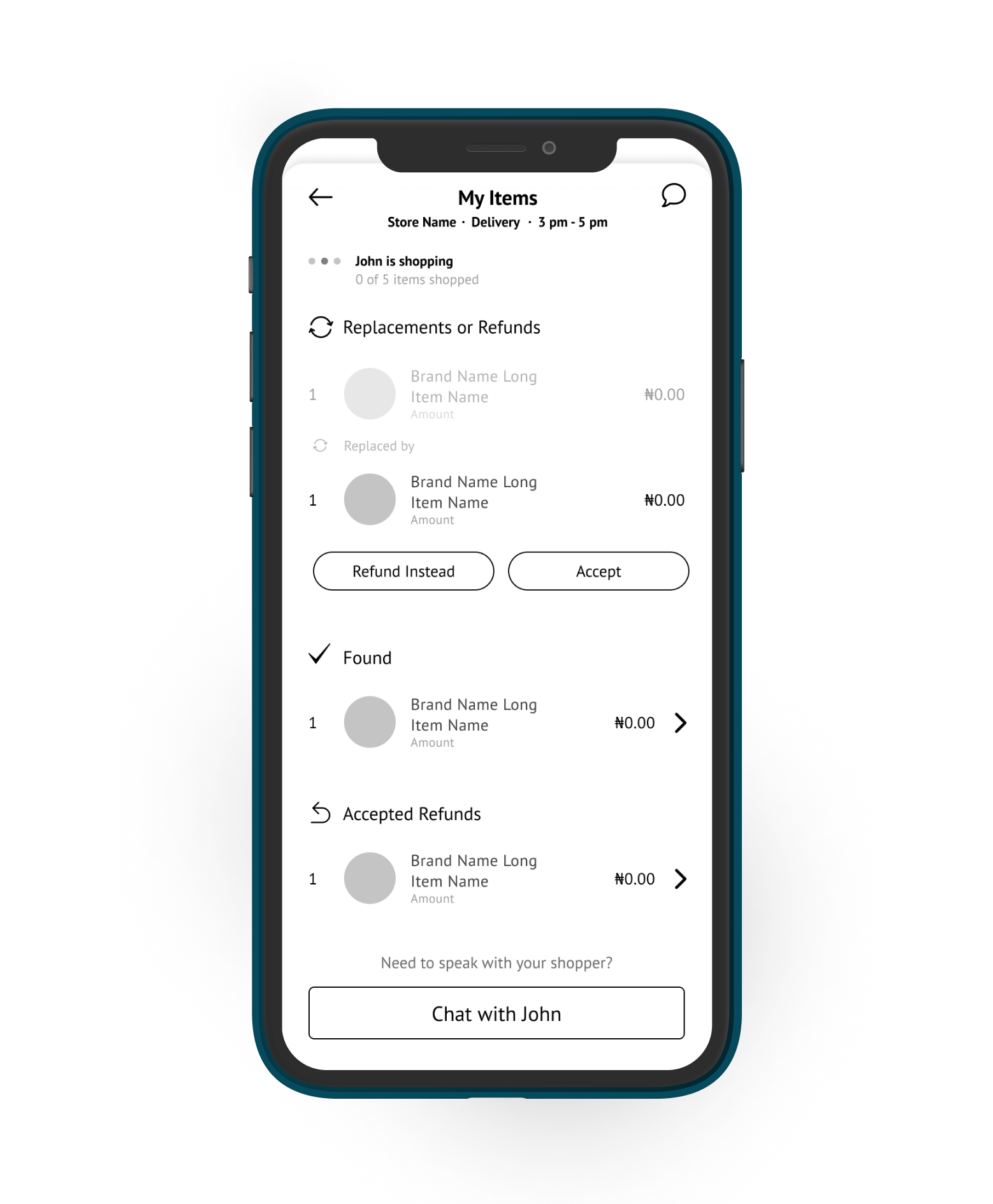
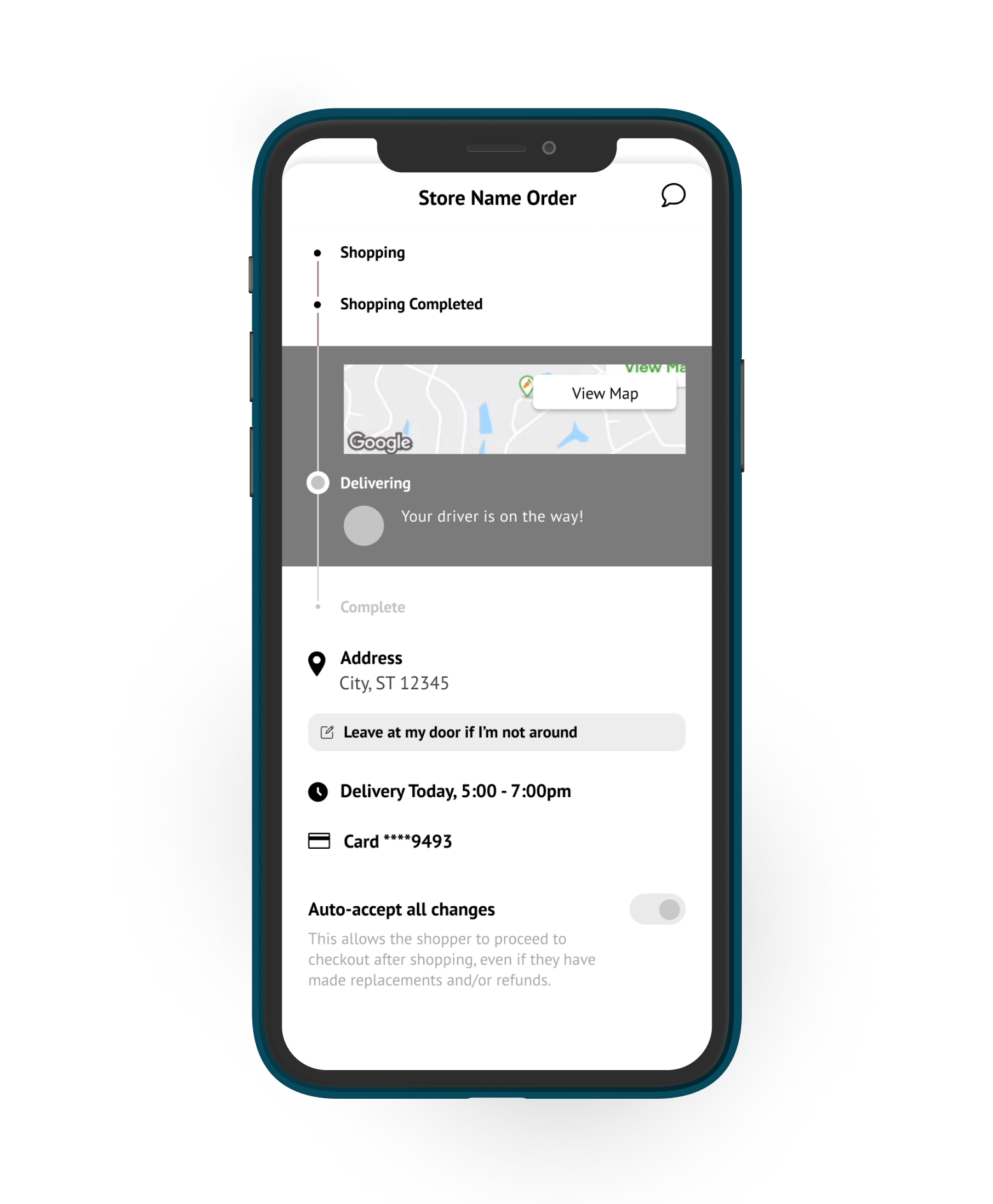
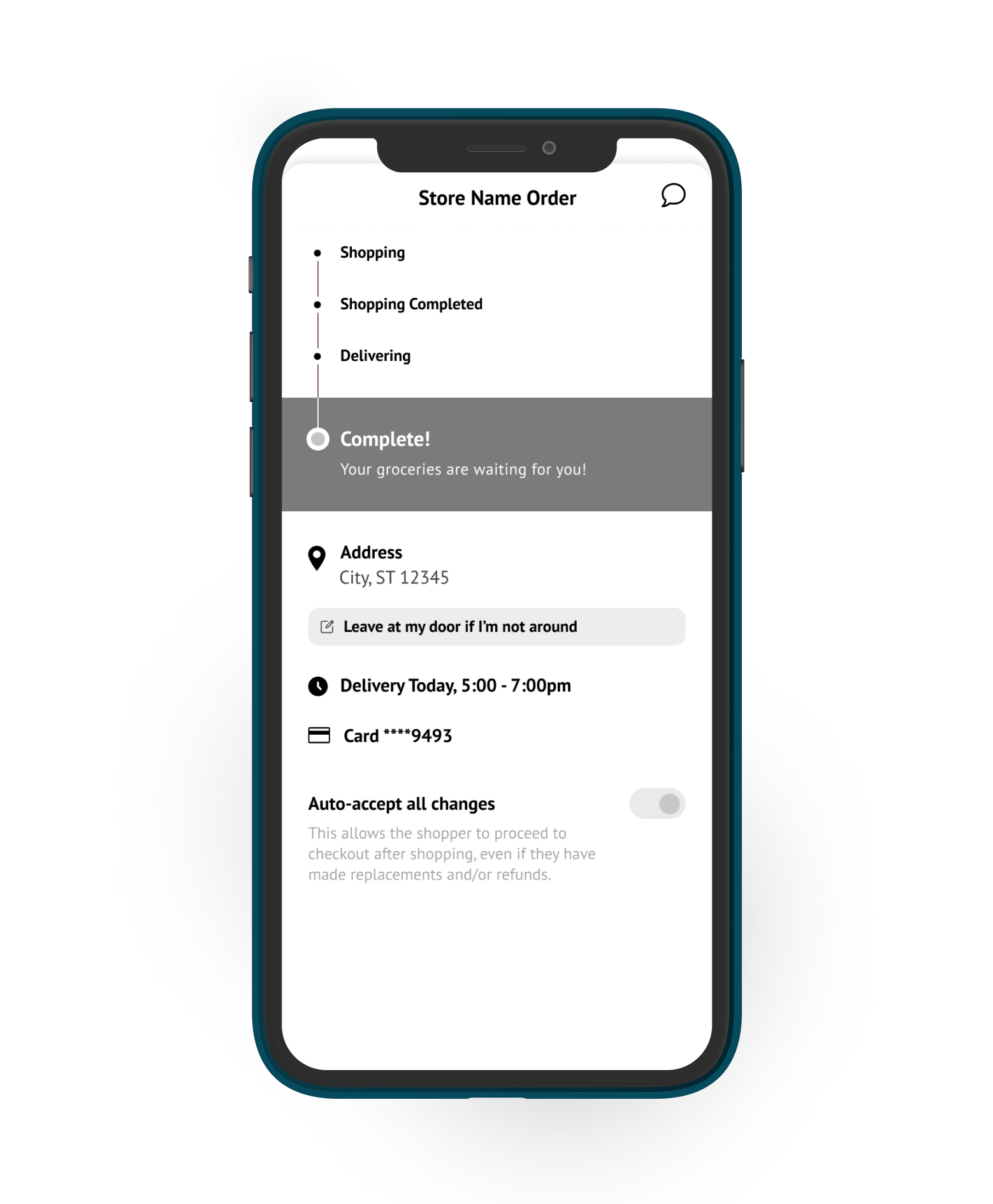
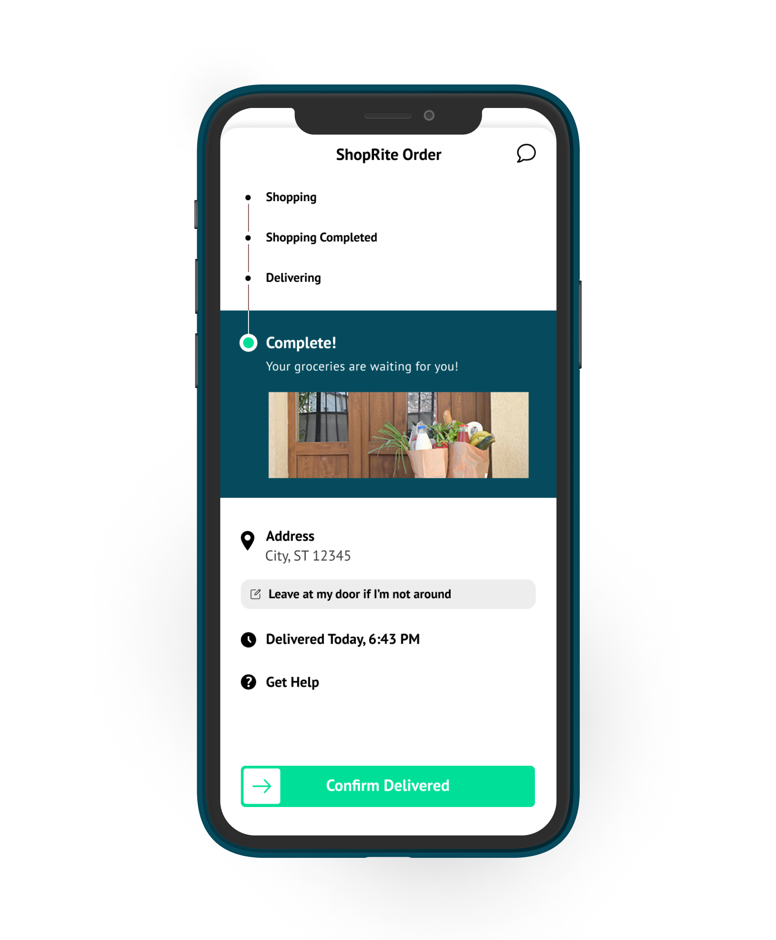
Shopper Side - Order Placed Flow - Wireframes x HiFi
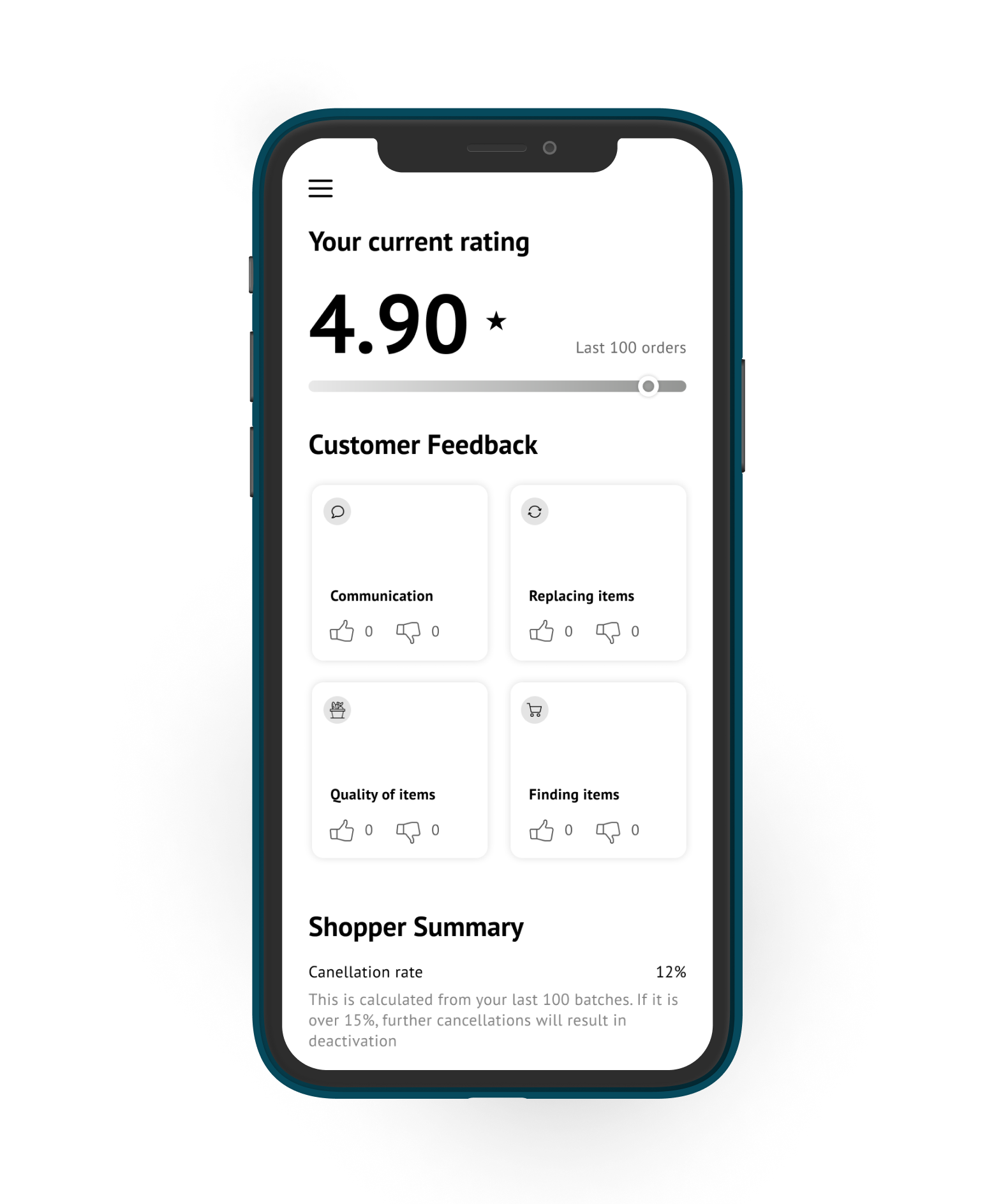
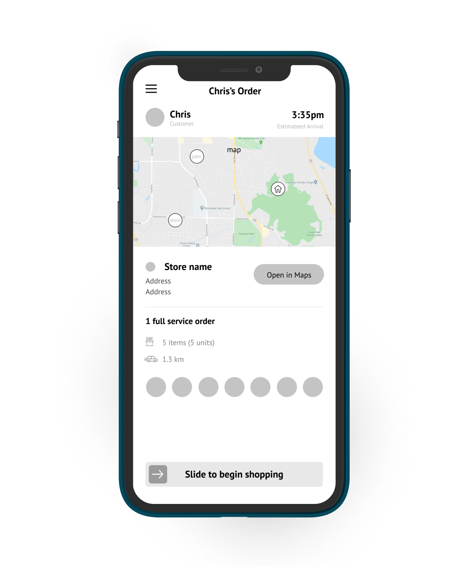
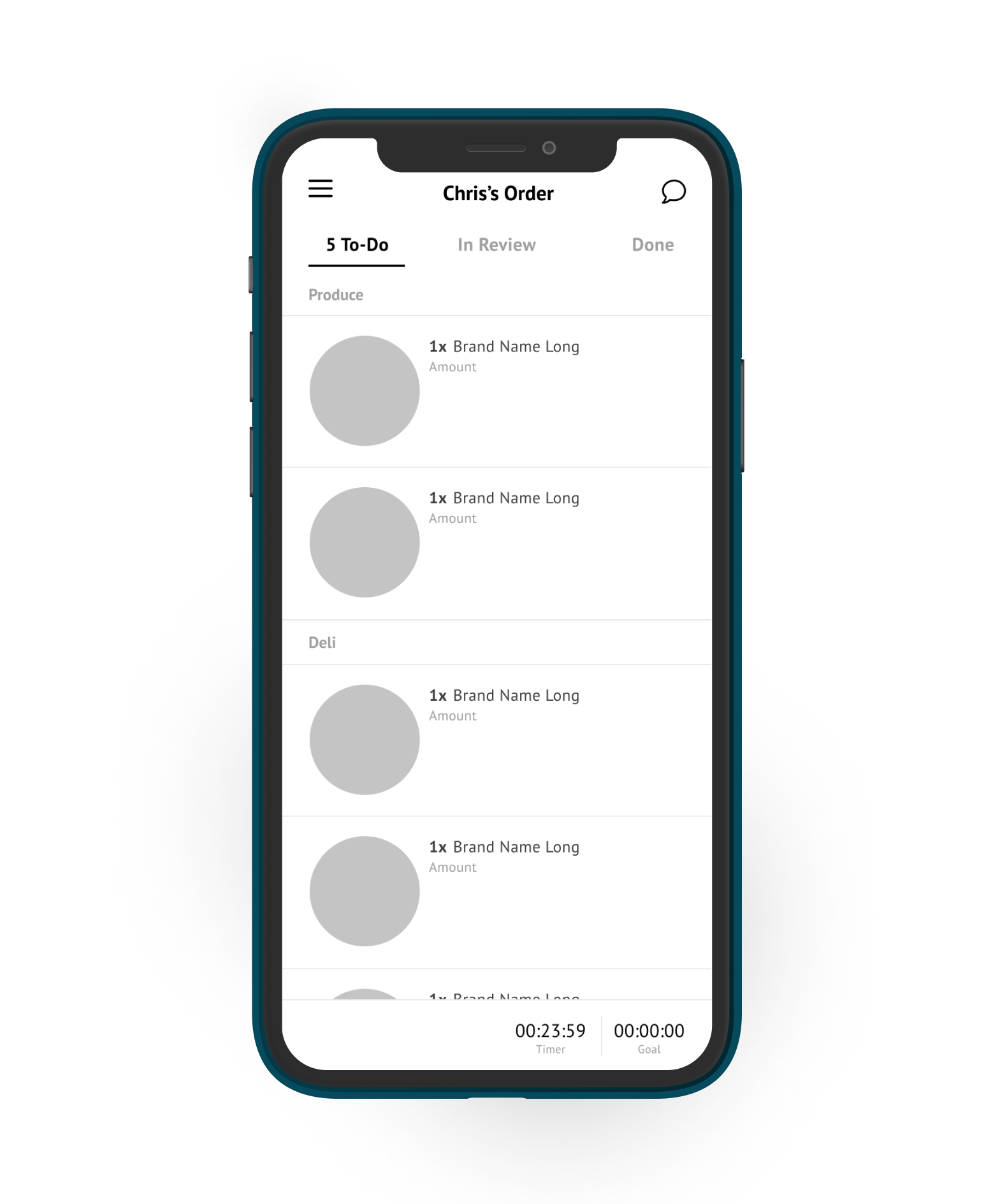
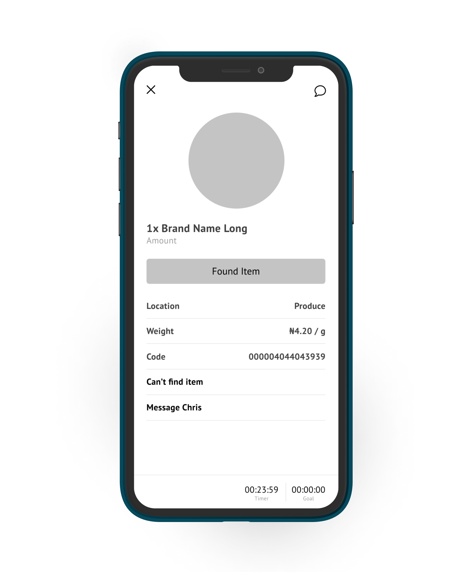
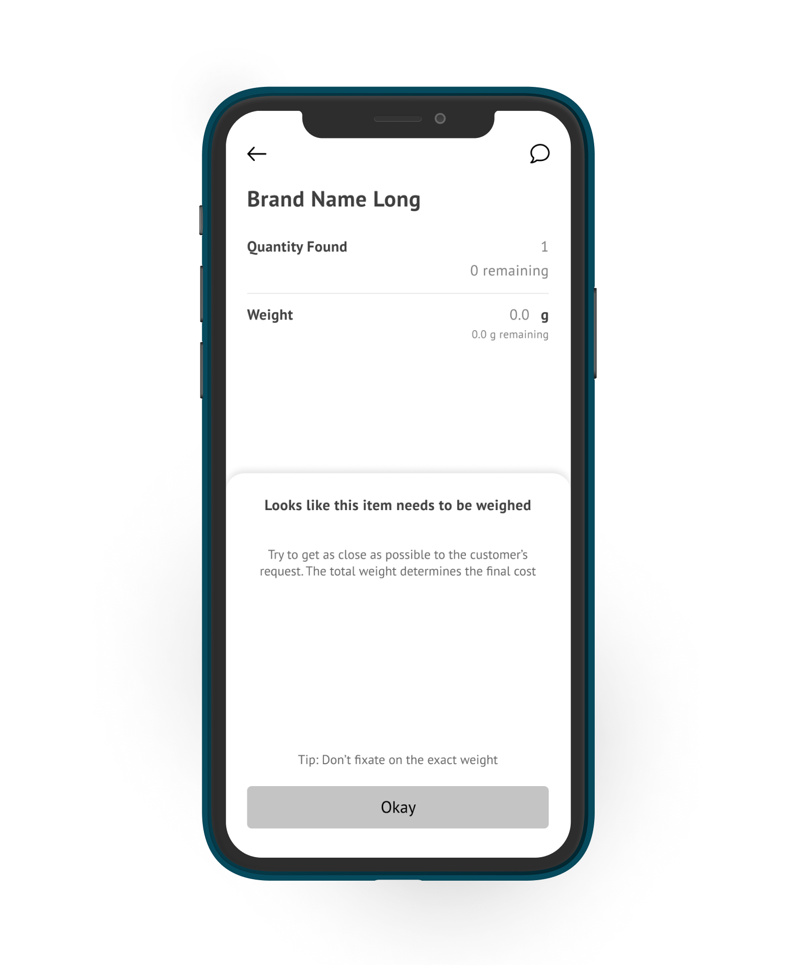
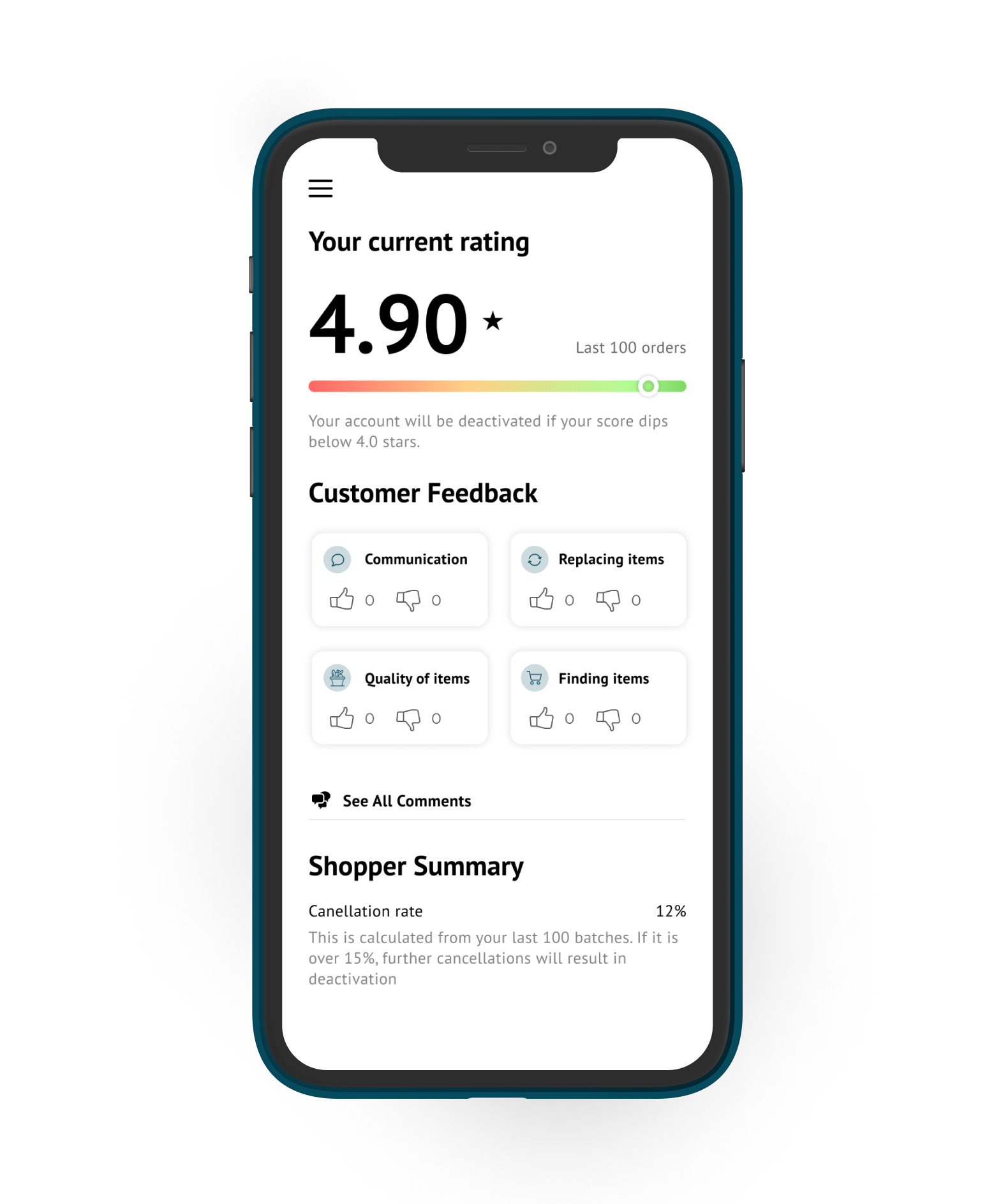
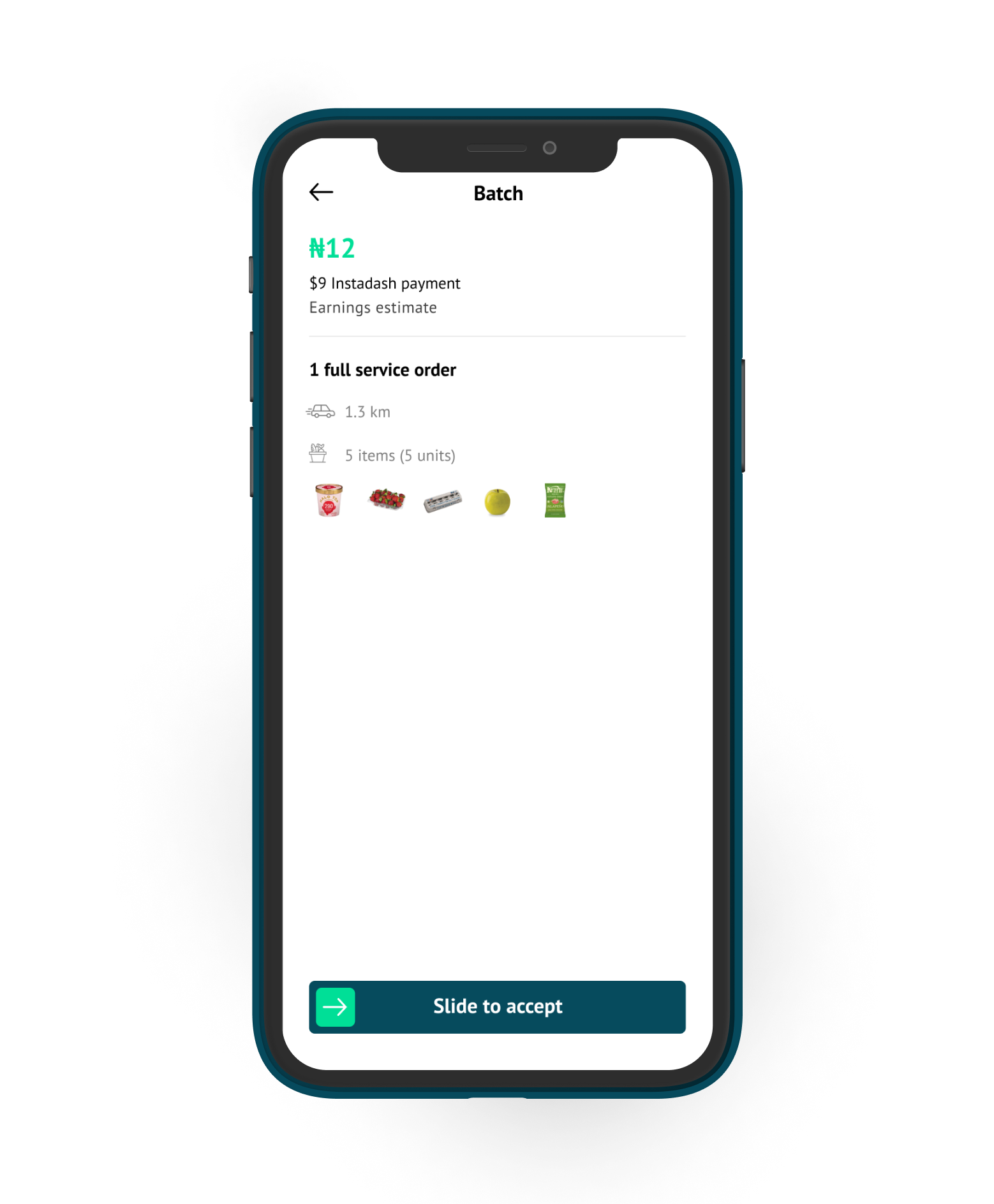
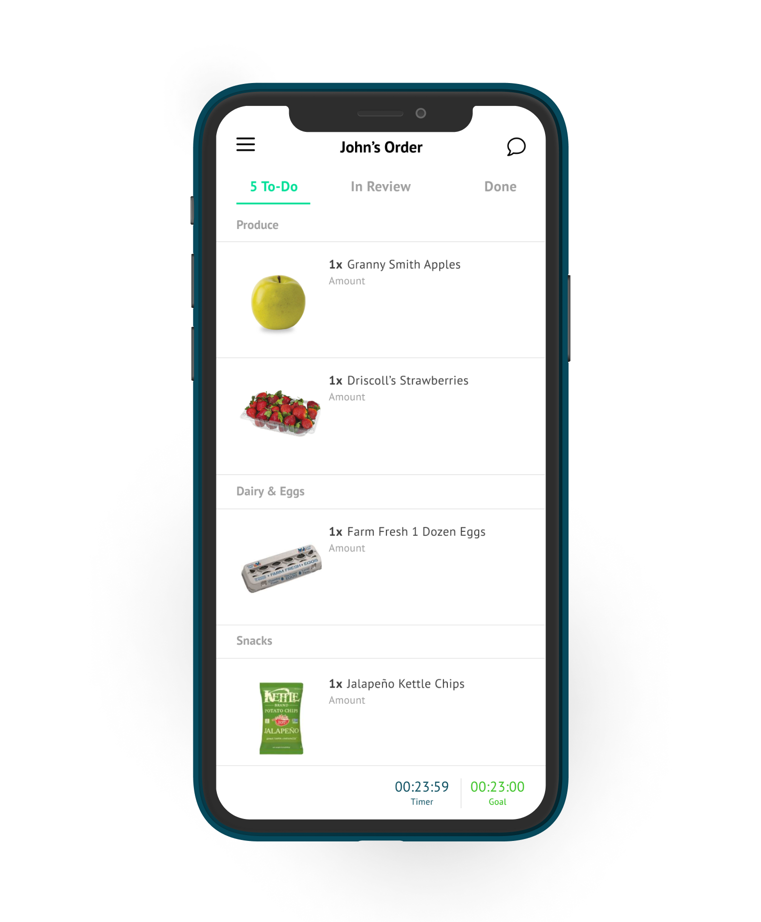
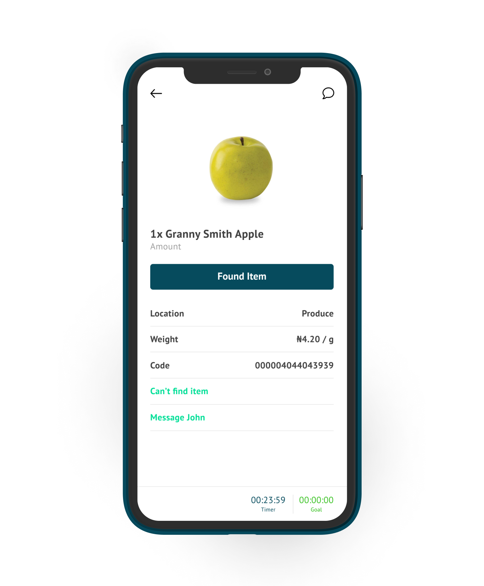
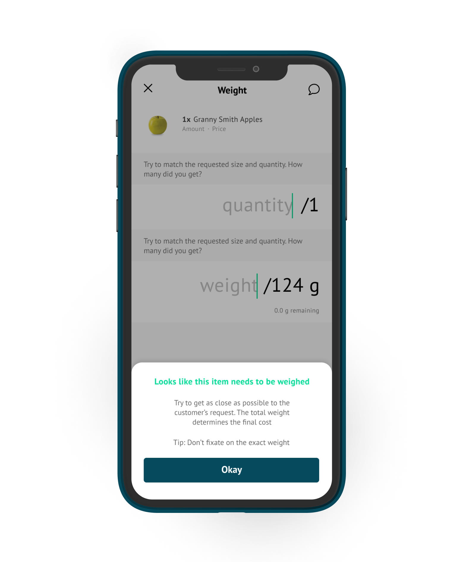
Mobile-first InstaDash revolutionizes on-demand grocery delivery with seamless user experience.
I designed InstaDash as a mobile-first, on-demand grocery delivery platform tailored to provide a seamless shopping experience. By leveraging mobile technology, the app allows users to order groceries and essentials from various retailers directly from their devices. I focused on creating a streamlined interface that facilitates easy order placement and tracking.

